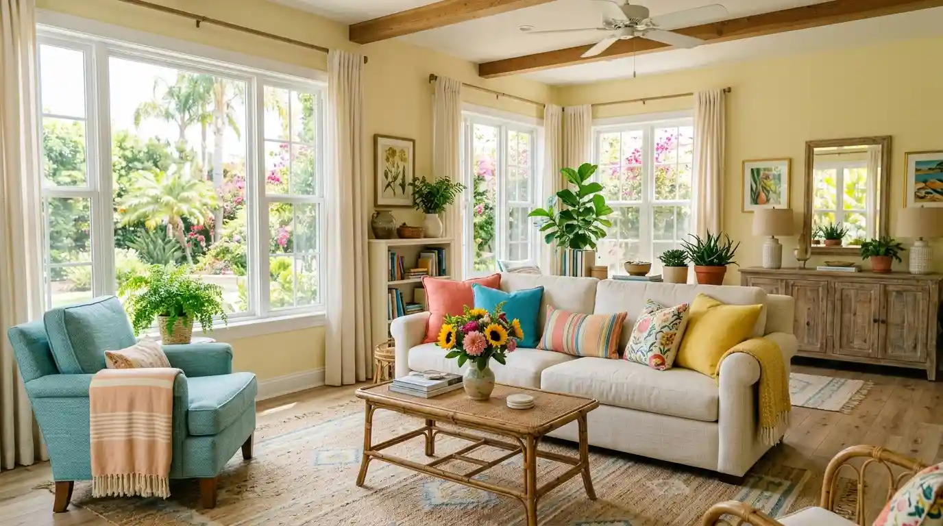
Stuck with walls that feel like a rainy Tuesday in London?
I once painted my guest room a “sophisticated” charcoal only to realize
I’d basically moved into a tomb. We deserve a home that radiates sunshine even when it’s freezing outside.
Let’s look at the best shades to keep those vacation vibes alive every single day of the year.
1. Crisp Soft White
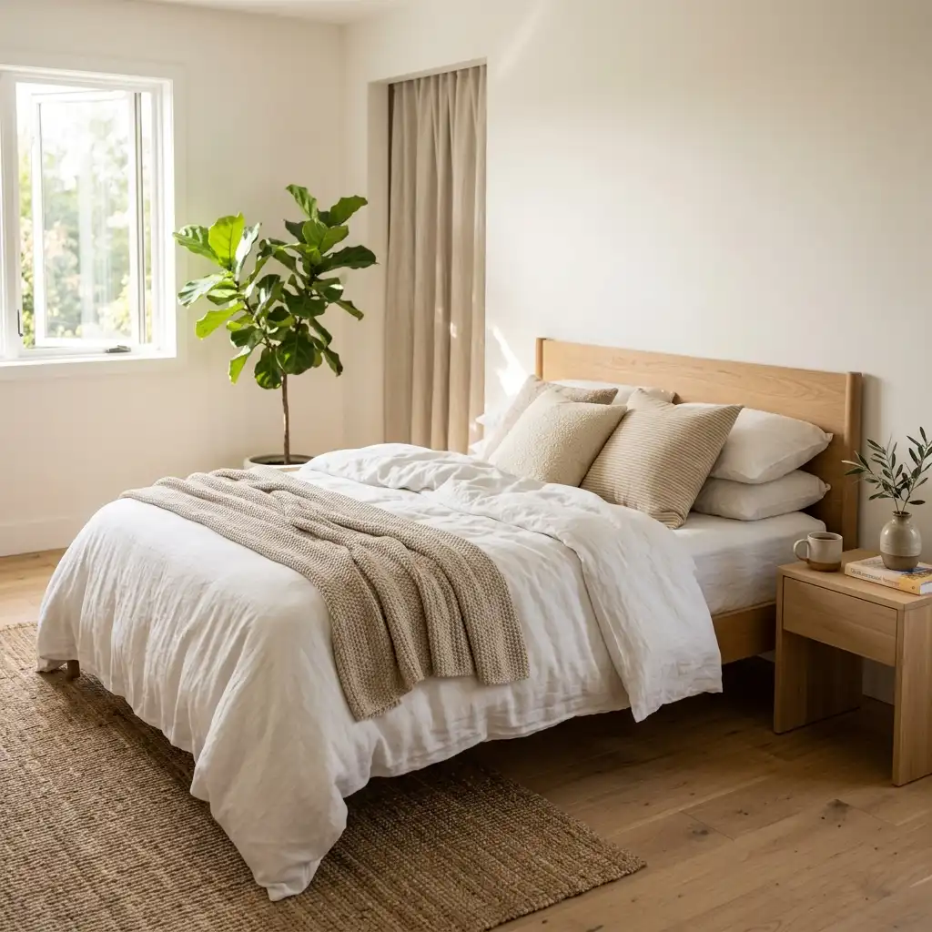
Nothing beats a clean slate. I find that soft white acts like a mirror, bouncing every bit of natural light around the room.
It mimics the look of a breezy Mediterranean villa, even if your view is actually just a suburban driveway.
Are you worried it will look too much like a sterile hospital?
Pick a white with warm undertones rather than blue ones.
It creates a soft, inviting glow that makes your furniture pop.

2. Pale Sky Blue
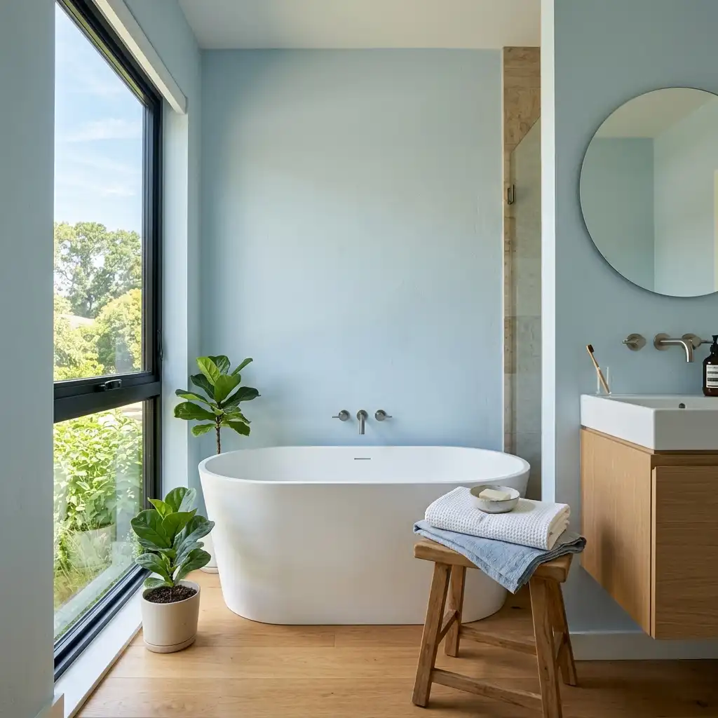
Bringing the sky indoors is the ultimate summer hack.
I used a misty, pale blue in my bathroom, and now I feel like I’m at a spa every morning.
It lowers the visual temperature of a room, which is great for those humid July afternoons.
Why sky blue wins:
- Relaxation: It naturally lowers your heart rate.
- Versatility: It pairs perfectly with white or wood trim.
- Brightness: It makes small ceilings feel infinitely higher.
3. Sunny Buttercream Yellow
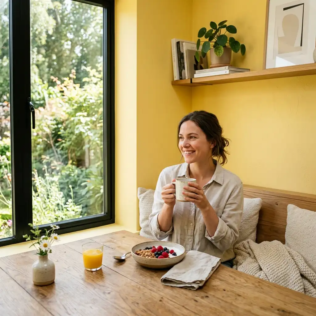
Yellow can be a bit scary, right? I steered clear of it for years until I found buttercream yellow.
It provides the warmth of a sunbeam without making you feel like you’re trapped inside a giant lemon.
Warm yellows add a cheerful energy to kitchens and breakfast nooks.
You’ll find it much easier to wake up when your walls are literally smiling at you.
IMO, it’s the best antidepressant you can buy in a gallon can. 🙂
4. Sandy Beige
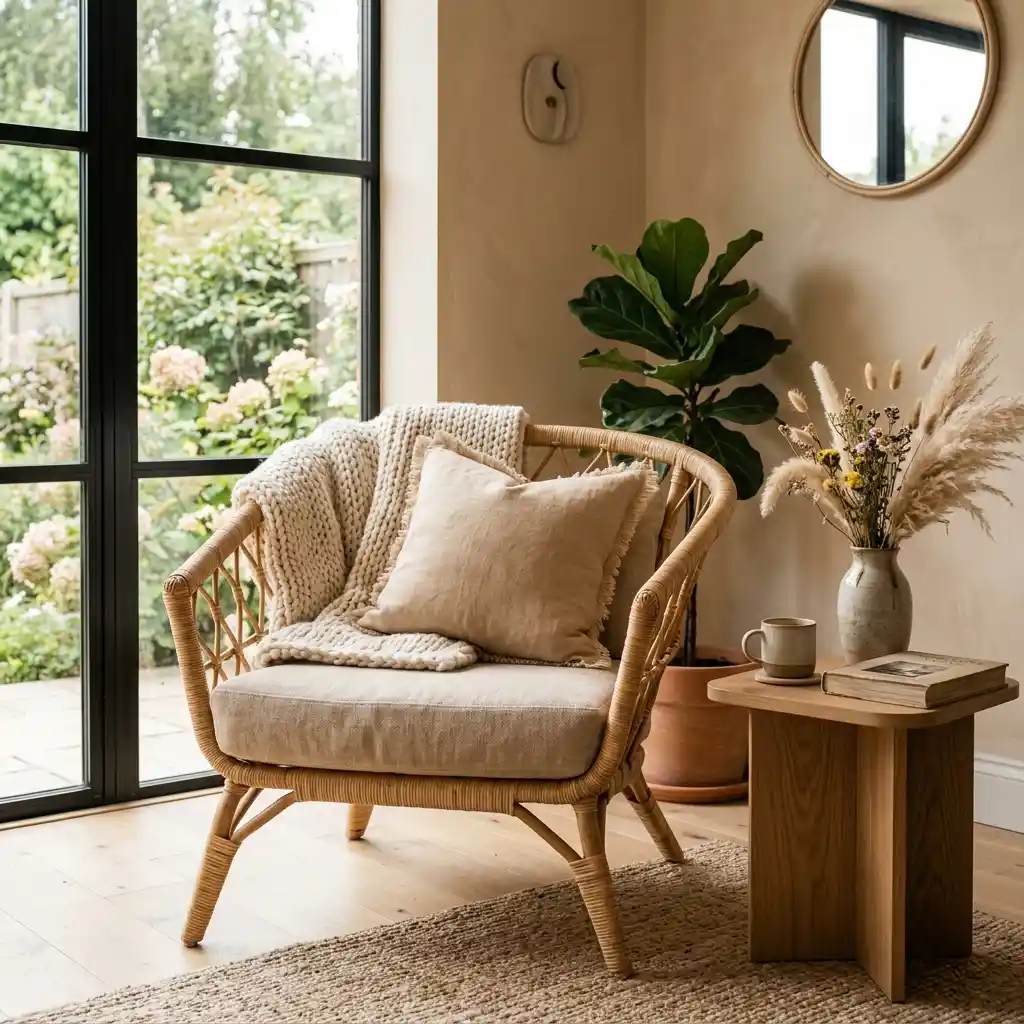
Forget boring tans; we’re talking about the color of a pristine beach.
I love using sandy beige because it provides a neutral backdrop that feels organic and warm.
It grounds a room while keeping things airy and light.
Ever noticed how sand looks different as the light changes?
This color does the same thing, shifting beautifully from morning to night.
It’s the perfect foundation for coastal decor and wicker furniture.
5. Refreshing Mint Green
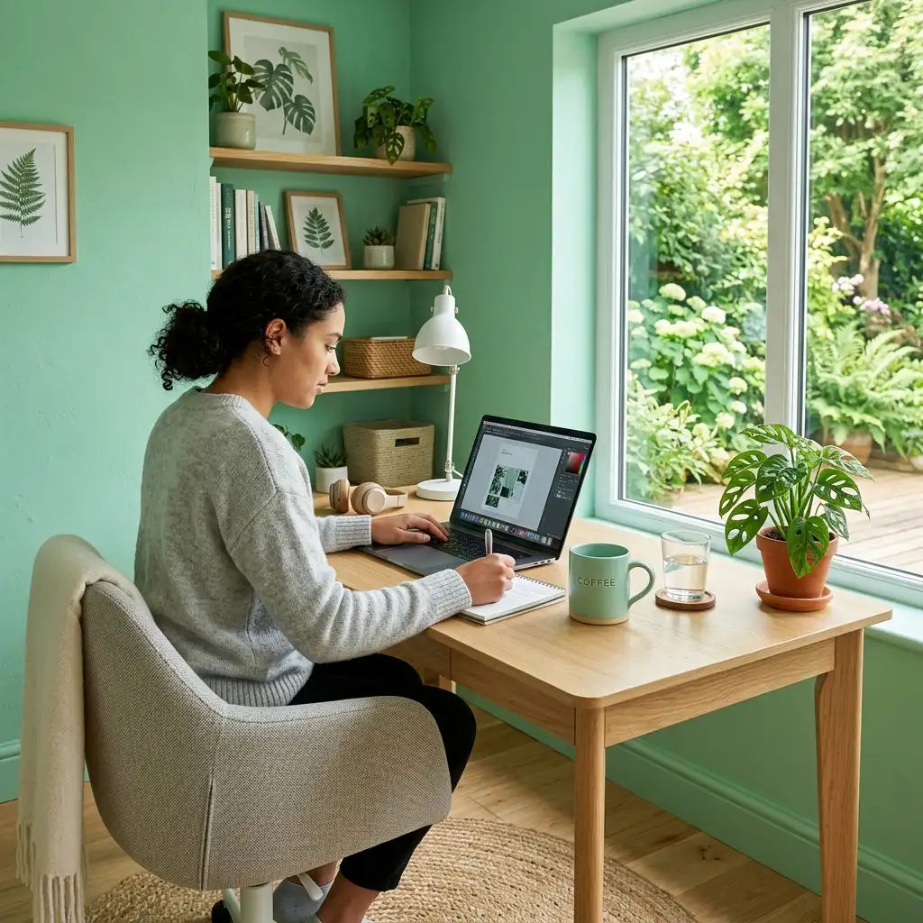
Mint green feels like a cold mojito for your eyes.
I painted my home office this shade, and it instantly boosted my focus.
It’s a vibrant yet soothing color that bridges the gap between the outdoors and your living room.
Best Places for Mint
- The Kitchen: Pairs amazingly with white cabinetry.
- Home Office: Keeps your brain sharp and alert.
- Laundry Room: Makes chores feel slightly less like a prison sentence.
6. Tropical Coral
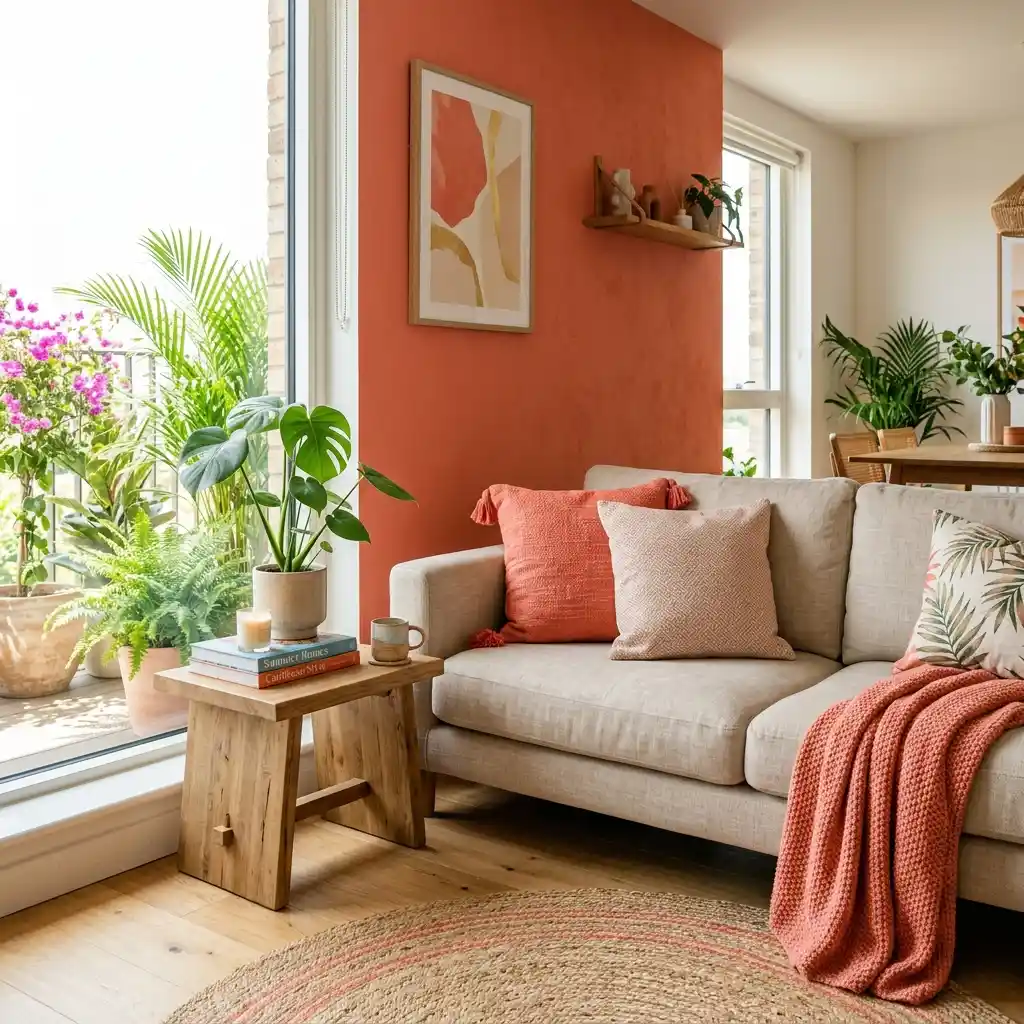
If you want a bold statement, coral is your best friend.
I usually suggest using this as an accent wall or on a front door.
It’s punchy, energetic, and reminds me of Caribbean sunsets and late-night beach bonfires.
Does your living room feel a bit flat?
A few coral throw pillows or a rug can wake up a neutral space instantly.
It adds a sophisticated “pop” that feels intentional rather than accidental.
7. Ocean Turquoise
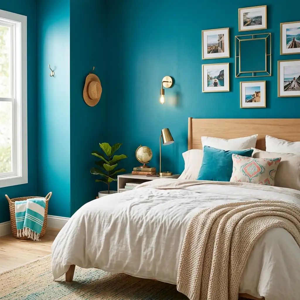
Turquoise is the “cool kid” of the summer color palette.
I find that it works best in well-lit spaces where the pigments can really shine.
It’s bold, sure, but it also carries the calming weight of the deep sea.
Turquoise offers unique benefits:
- Depth: It adds visual interest to flat walls.
- Pairing: It looks incredible next to gold or brass fixtures.
- Mood: It creates an adventurous, wanderlust-filled atmosphere.
8. Dusty Terracotta
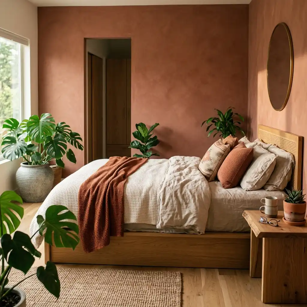
Summer isn’t just about the beach; it’s also about the desert heat.
I’ve grown to love dusty terracotta for its earthy, baked-clay feel.
It adds a sense of history and warmth that “cooler” summer colors sometimes lack.
Think of it as the interior design equivalent of a tan.
It makes a room feel cozy and grounded. Pair it with plenty of green plants for a lush,
Southwestern look that feels expensive.
9. Seafoam Green
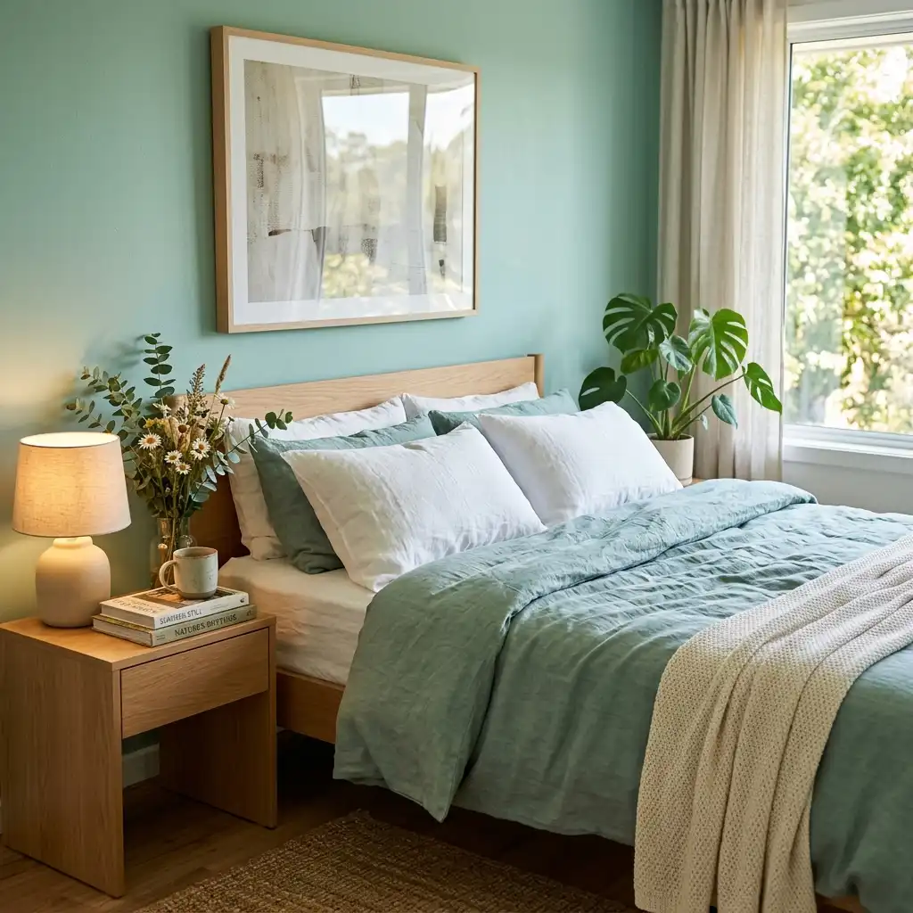
Seafoam is like mint’s more relaxed, sophisticated older sister.
I used this in my bedroom to create a peaceful sanctuary that feels miles away from the city.
It’s a subtle nod to the ocean without being too literal.
Why do we love this color so much?
It’s because it mimics the shallow waters of a tropical shore.
It’s light enough to act as a neutral but has enough pigment to stand on its own.
10. Bright Tangerine
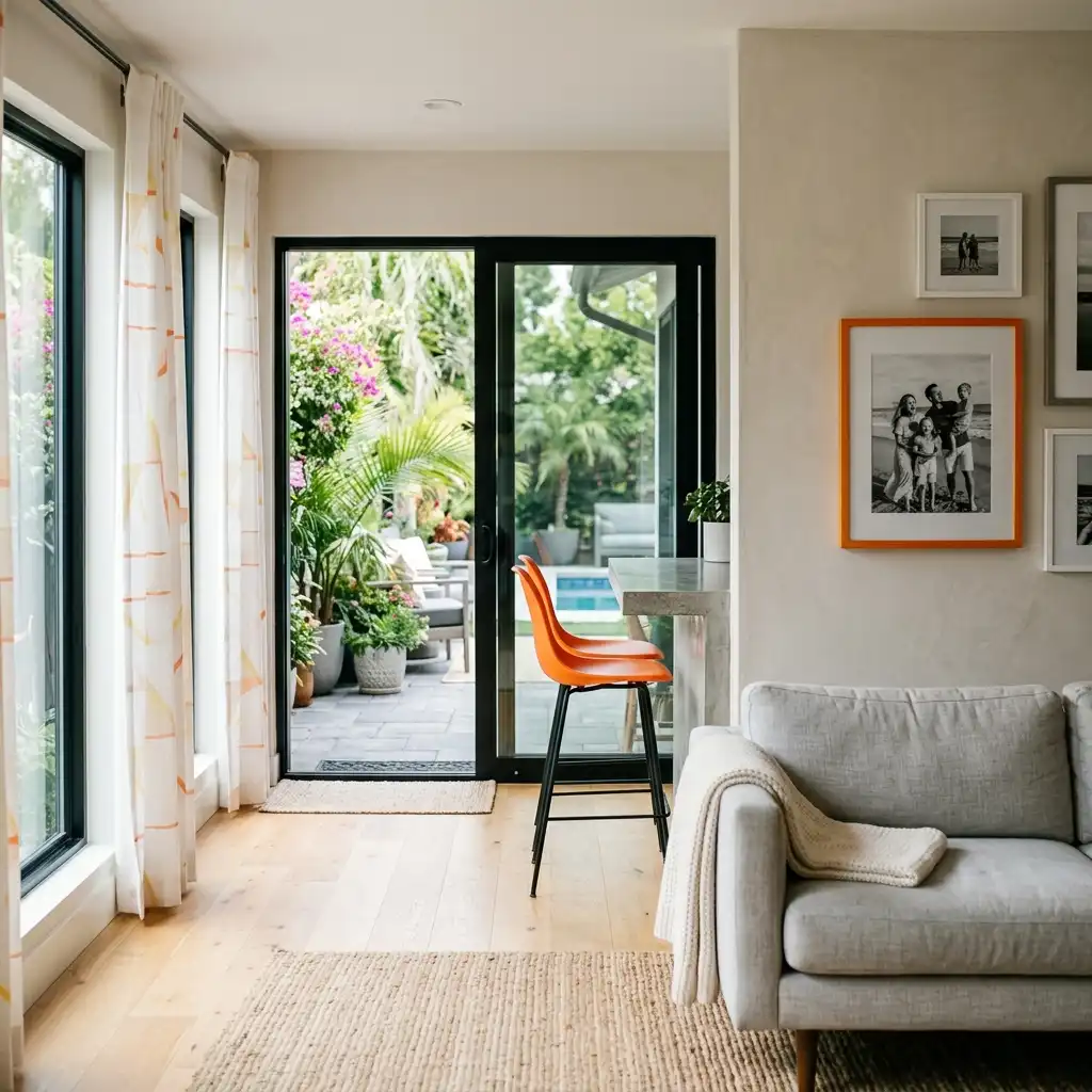
Ready to get a little wild? Tangerine is a high-energy color that screams “pool party.”
I wouldn’t paint an entire bedroom this color—unless you hate sleep—but it’s perfect for a sunroom or a patio.
Ways to Use Tangerine
- Patterned Curtains: For a burst of citrus energy.
- Art Frames: To highlight your favorite summer memories.
- Bar Stools: Makes the “happy hour” vibe permanent.
11. Nautical Navy Blue
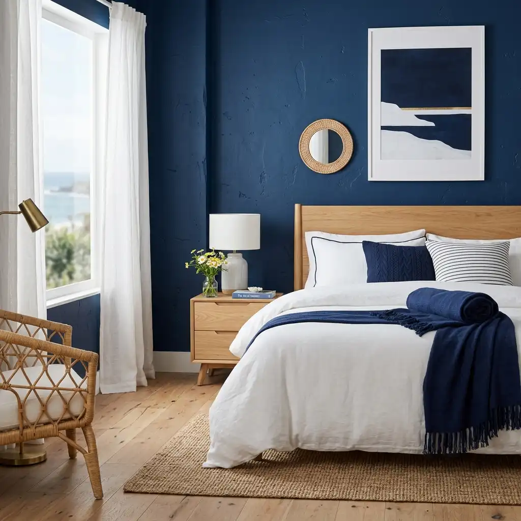
Navy is the “little black dress” of summer decor.
I love how a deep navy accent wall makes white furniture look crisp and expensive.
It provides a beautiful contrast that reminds me of yacht clubs and sailing trips.
Does navy feel too dark for summer? Not if you balance it with plenty of white and light wood.
It actually makes a room feel cooler by absorbing some of the glare from intense afternoon sun.
12. Soft Blush Pink
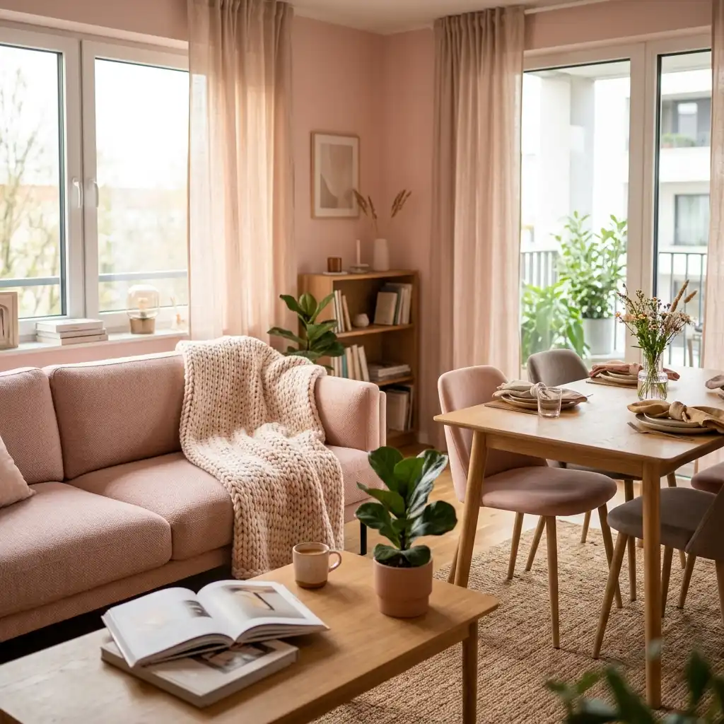
Blush pink isn’t just for nurseries anymore.
I think of it as the color of a summer sunset just before the stars come out.
It’s a warm, flattering neutral that makes everyone in the room look like they have a healthy glow.
Try using it in a dining room or a lounge area.
It creates a soft, romantic atmosphere that’s perfect for long summer dinners.
FYI, it also hides a bit of dust better than pure white!
13. Deep Forest Green
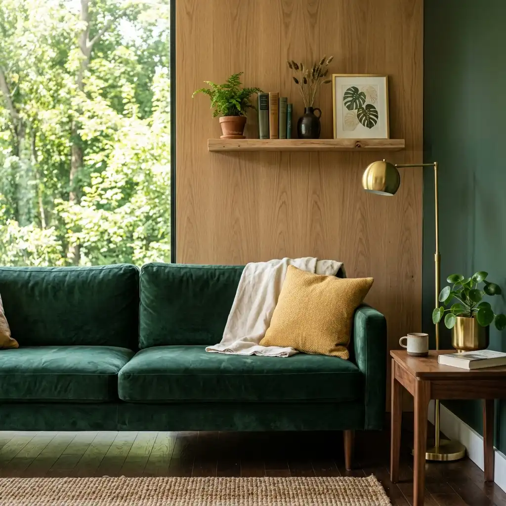
You might think forest green is for winter, but it’s actually a summer powerhouse.
It represents the lush, full canopy of mid-August.
I use it to bring a sense of shade and coolness to rooms that get too much direct sun.
How to style forest green:
- Velvet Textures: For a touch of luxury.
- Natural Wood: To lean into the “cabin in the woods” vibe.
- Gold Accents: To keep the look polished and bright.
14. Lavender Mist
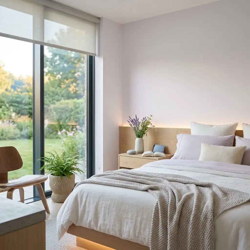
Lavender is the ultimate “cooling” color.
I find that a very pale lavender can actually feel more neutral than gray.
It has a botanical freshness that reminds me of wandering through a summer garden at dawn.
Is your home part of your 13 spring cleaning checklist organization routine?
Lavender is the perfect “reward” color for a clean space. It feels airy, light, and totally un-cluttered.
It’s the perfect finishing touch for a summer-ready home. :/
Changing your home’s color palette is the fastest way to trick your brain into thinking it’s vacation time.
Whether you go for a bold tangerine or a safe, sandy beige, the goal is to make your space feel alive.
So, which of these sun-drenched shades is calling your name?
Grab a paintbrush and let’s turn that winter cave into a summer dreamland!