
So, you’re hosting Thanksgiving this year, or at least planning your tablescape?
That’s great! Let’s face it—nothing shouts “modern and chic” like a color palette from Pinterest. The days of pumpkin orange and dull browns are behind us.
Now, the modern Thanksgiving color palette is all about fresh tones and unexpected combos. It conveys, “I put in effort,” even if you just mixed gold with beige.
Want your Thanksgiving decor to feel stylish and inviting? You’ll get at least three compliments before dessert!
Let’s dive into 13 modern Thanksgiving color palette ideas to set the perfect tone for your celebration.
1. Warm Neutrals & Gold Glam ✨
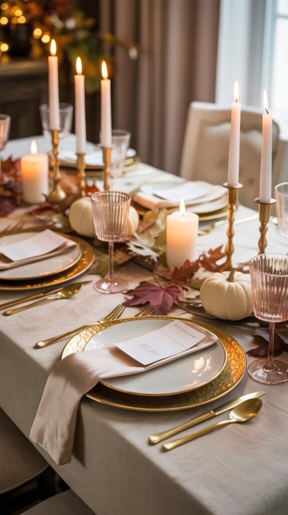
Think creamy whites, soft beige, and metallic gold touches. This palette screams effortless elegance without looking like you raided a craft store.
- Why it works: It’s timeless and goes with literally any interior style—from farmhouse to minimalist.
- Pro tip: Add gold-rimmed glasses or metallic charger plates for a subtle luxe feel.
- Product idea: Try the Godinger Gold Rim Dinnerware Set on Amazon—it’s the glam touch your Thanksgiving table deserves.
2. Terracotta & Olive Green
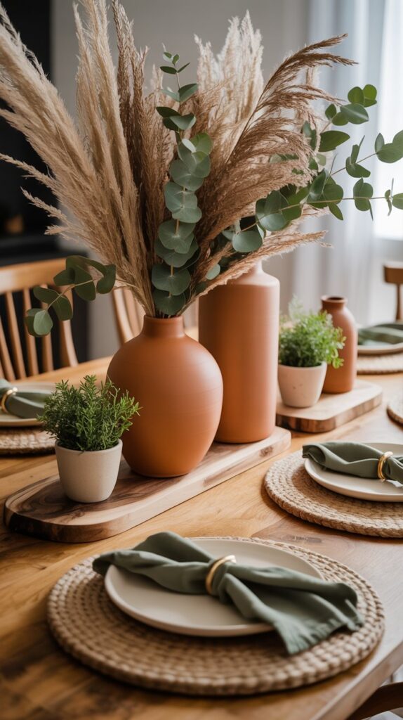
A chic twist on traditional fall colors. Terracotta adds warmth, while olive tones bring in that grounded, organic vibe.
- Why it works: It feels cozy yet modern, especially when mixed with matte textures.
- Pair it with: Natural linens, jute placemats, or ceramic vases.
- Product pick: The Mkono Terracotta Ceramic Vase Set—perfect for your Thanksgiving centerpiece.
3. Dusty Rose & Cream
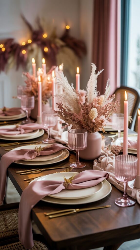
Who said pink can’t do Thanksgiving? Dusty rose tones paired with creamy whites create a soft, romantic table that still feels festive.
- Why it works: It’s feminine, modern, and surprisingly versatile.
- Design tip: Add dried florals or pampas grass to balance the sweetness.
- Product idea: The Ling’s Moment Dried Flower Centerpiece Kit—ideal for effortless elegance.
4. Burnt Orange & Deep Plum
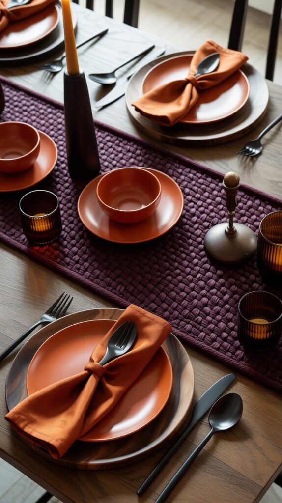
This one’s for those who like color but still want to keep things sophisticated. Burnt orange gives the fall warmth, and plum adds a little drama.
- Why it works: It’s bold but balanced—perfect for statement makers.
- Styling idea: Mix in dark wooden accents or black cutlery.
- Product pick: Try the Benson Mills Solid Woven Table Runner in Plum—it ties the look together beautifully.
5. Sage Green & Mustard Yellow
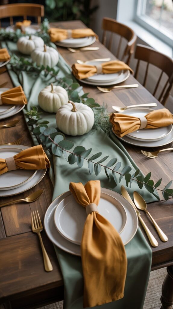
It’s like your favorite fall sweater turned into a color palette. Soft, earthy, and totally in right now.
- Why it works: It’s bright yet muted enough to stay classy.
- Pro tip: Add white pumpkins and eucalyptus stems for a natural finish.
- Product idea: The DearHouse Artificial Eucalyptus Garland—a must for your Thanksgiving runner.
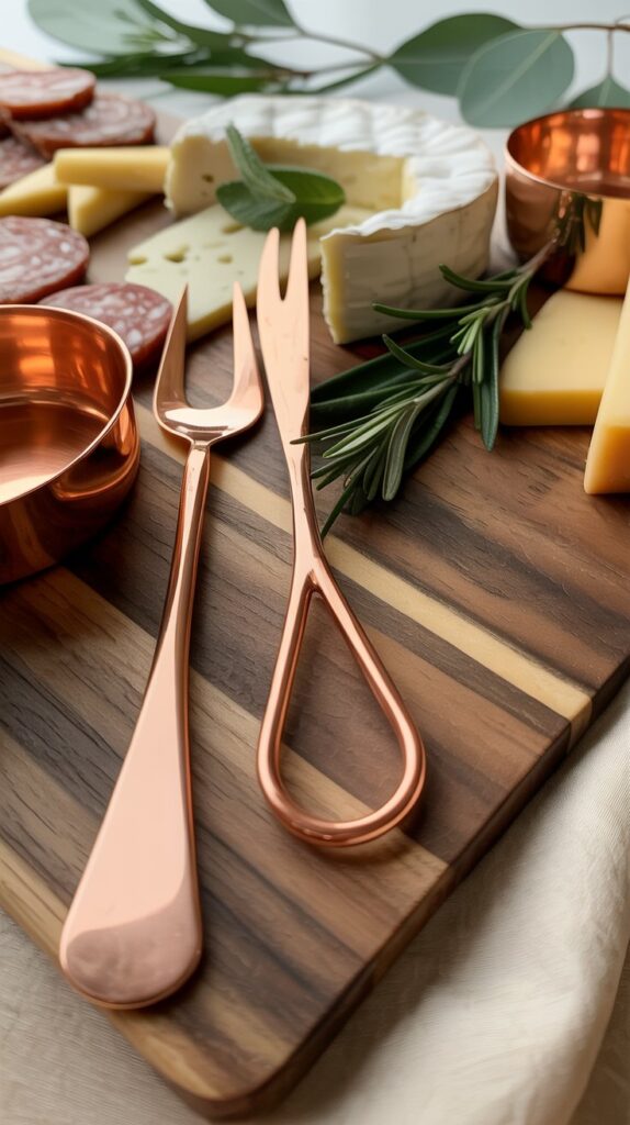
6. Navy Blue & Copper
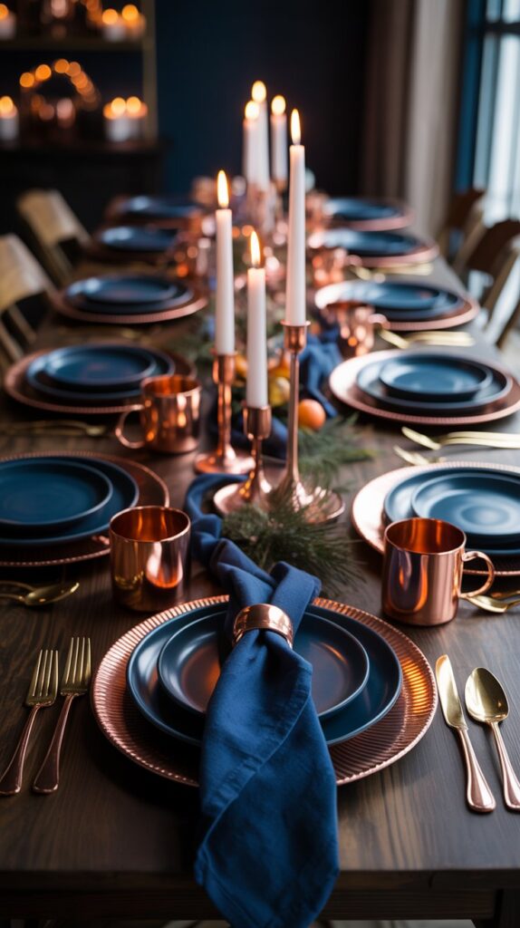
Yes, navy for Thanksgiving! It’s chic, it’s moody, and it pairs beautifully with the warmth of copper.
- Why it works: It’s modern and unexpected, but still cozy.
- Design tip: Use copper mugs or candle holders for that metallic pop.
- Product pick: Moscow Mule Copper Mugs by A29—functional and gorgeous.
7. Cream, Charcoal & Wood
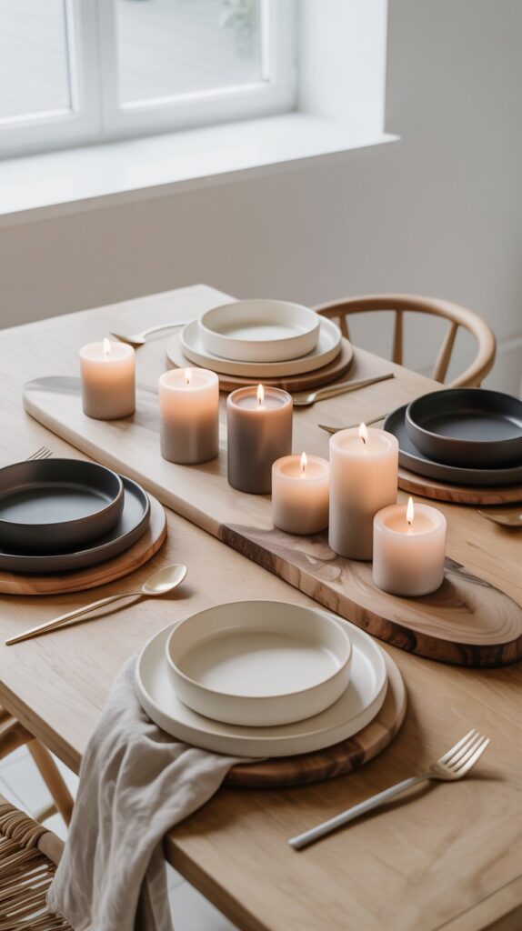
If you’re into the “less is more” aesthetic, this palette is for you. Think Scandinavian Thanksgiving—clean, calm, and cozy.
- Why it works: The textures do the talking—linen, wood, and matte ceramics.
- Pro tip: Layer neutral-toned candles for added depth.
- Product idea: The Yinuo Mirror Soy Candle Set—minimalist design, maximum ambiance.
8. Burgundy & Blush
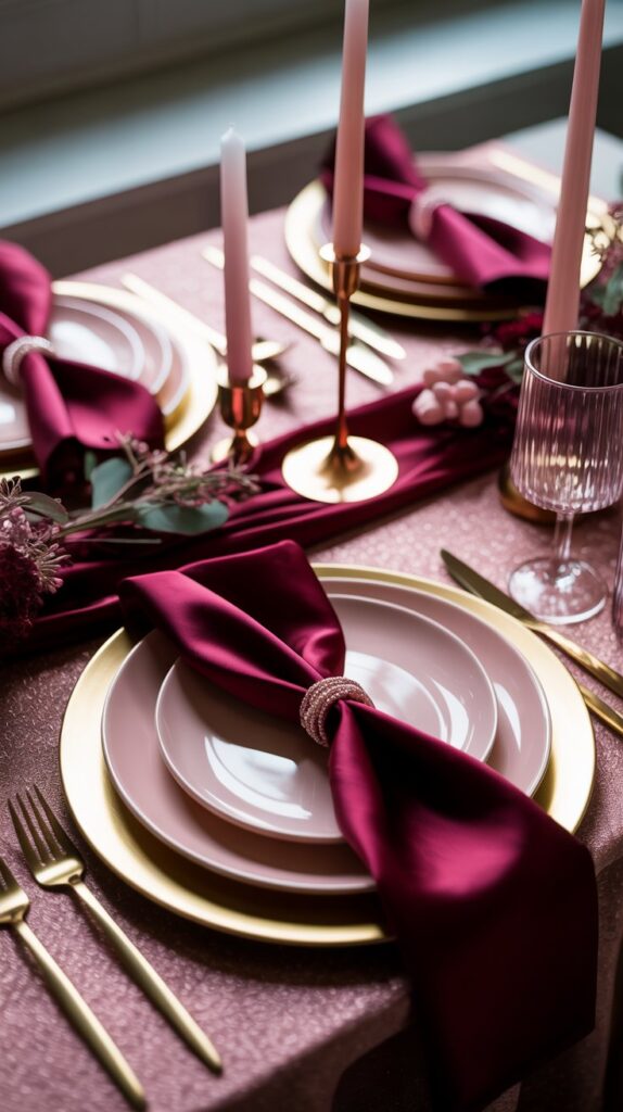
Romantic, rich, and totally on-trend. This pairing bridges the gap between fall and winter perfectly.
- Why it works: Burgundy anchors the look while blush keeps it fresh and light.
- Design tip: Use rose gold accents to tie the tones together.
- Product pick: The Elrene Home Fashions Rose Gold Tablecloth—a subtle yet stunning addition.
9. Black, White & Gold
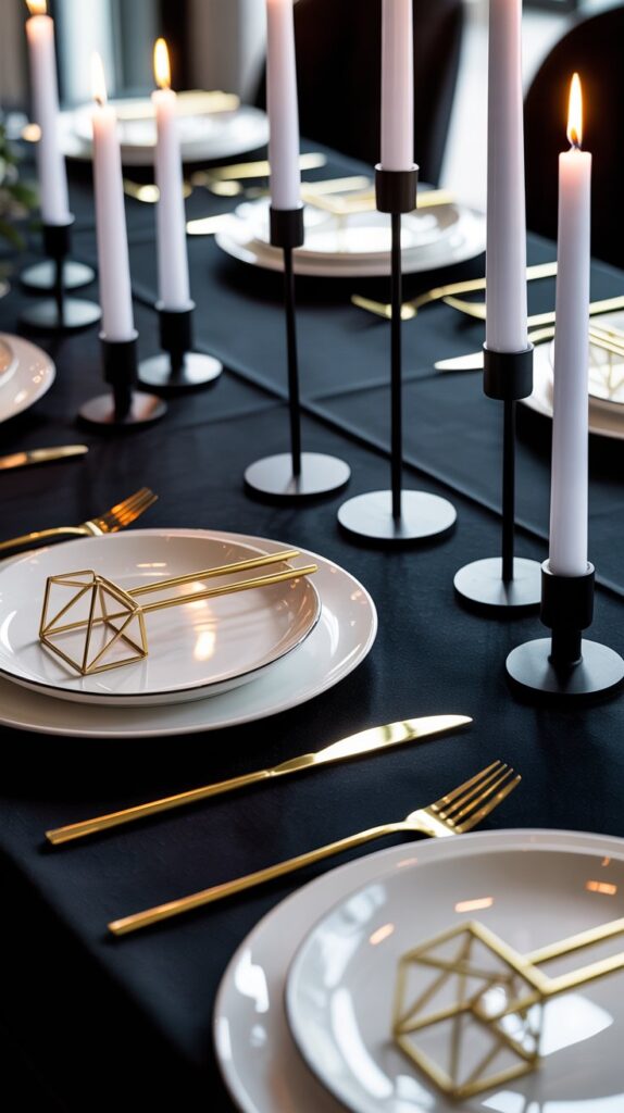
Modern meets glam. This combo feels bold yet timeless—like Thanksgiving dinner at a modern art gallery (minus the pretentiousness).
- Why it works: It’s bold, graphic, and pairs beautifully with candlelight.
- Pro tip: Add geometric napkin rings or gold flatware for sophistication.
- Product idea: LIANYU Gold Silverware Set—a total upgrade for your table.
10. Emerald Green & Champagne
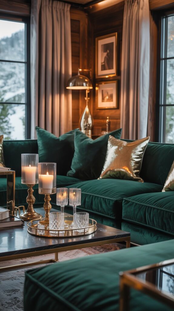
This one’s giving “luxury mountain cabin.” Deep green mixed with soft champagne hues feels rich and modern.
- Why it works: The contrast between bold and subtle creates instant depth.
- Styling idea: Add glass candle holders or crystal drinkware.
- Product pick: The JoyJolt Aurora Crystal Glass Set—perfect for elevating your toast.
11. Mocha & Rust
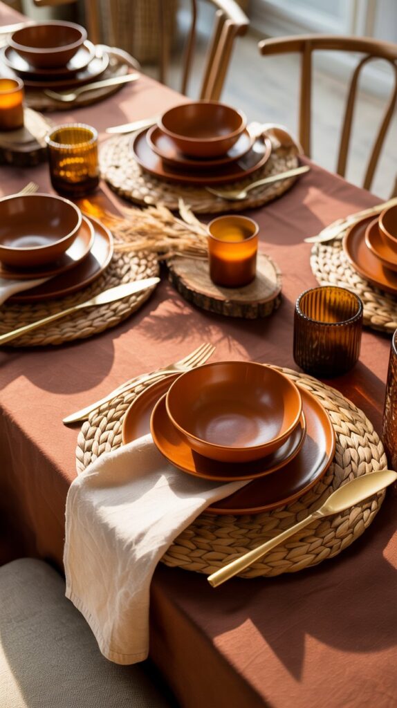
The cozy duo you didn’t know you needed. Mocha tones add warmth while rust brings the fall personality.
- Why it works: It’s inviting and cozy without looking dated.
- Pro tip: Pair it with linen napkins and rustic wood chargers.
- Product idea: DII Cotton Table Napkin Set in Mocha—simple, earthy, and stylish.
12. Soft Gray & Warm Taupe
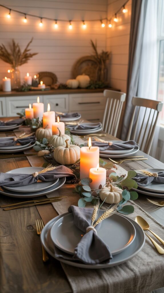
If your Thanksgiving aesthetic leans “modern farmhouse,” this one’s a keeper. Subtle, chic, and endlessly versatile.
- Why it works: It’s calm, neutral, and lets your decor shine without clashing.
- Design tip: Add soft lighting—string lights or warm-toned candles.
- Product pick: Homemory Flameless LED Candles—realistic glow, zero wax mess.
13. Copper, Cream & Forest Green
And finally, the trio that feels like a warm hug from Mother Nature. Earthy greens, creamy neutrals, and copper accents? Chef’s kiss.
- Why it works: It’s nature-inspired yet modern enough to fit any space.
- Styling idea: Use wooden boards and copper utensils for serving.
- Product idea: The Thirteen Chefs Walnut Charcuterie Board—functional and photogenic.
How to Mix and Match Like a Pro 🎨
Ever stood in front of your decor stash and thought, “Do these even go together?” Same. Here’s the trick: stick to three main colors (a base, a pop, and a neutral). Then, build your textures around that.
Example combo:
- Base: Sage Green
- Pop: Mustard Yellow
- Neutral: Cream
Boom. Instant balance.
Also, don’t underestimate texture—it’s what makes your palette feel layered and intentional. Think woven placemats, matte ceramics, or glossy metallics.
Bonus Tips for a Cohesive Look
Because let’s be honest, even the best color palette can flop without the right styling.
- Repeat colors in small accents (napkins, florals, candles) to create visual harmony.
- Use natural elements like pinecones, wood slices, or dried leaves for that organic warmth.
- Keep lighting soft—warm LED fairy lights or taper candles do wonders for ambiance.
- Add a statement centerpiece that ties all the colors together.
And for those who like things easy, pre-matched decor bundles are your best friend. You can find full Thanksgiving tablescape kits on Amazon that already nail these palettes—just unpack, arrange, and take the credit 😉.
Conclusion:
So, there you have it—13 modern Thanksgiving color palettes that prove you don’t have to stick with pumpkin orange to feel festive. Whether you’re drawn to moody navy and copper or soft sage and mustard, the key is to make it feel you.
Thanksgiving decor isn’t about rules—it’s about creating a space that feels warm, welcoming, and a little “wow.” Because, let’s face it, people might forget the turkey (okay, maybe not), but they’ll definitely remember how your table looked.
Now go mix, match, and make your Thanksgiving color story shine. 🍁✨